Process
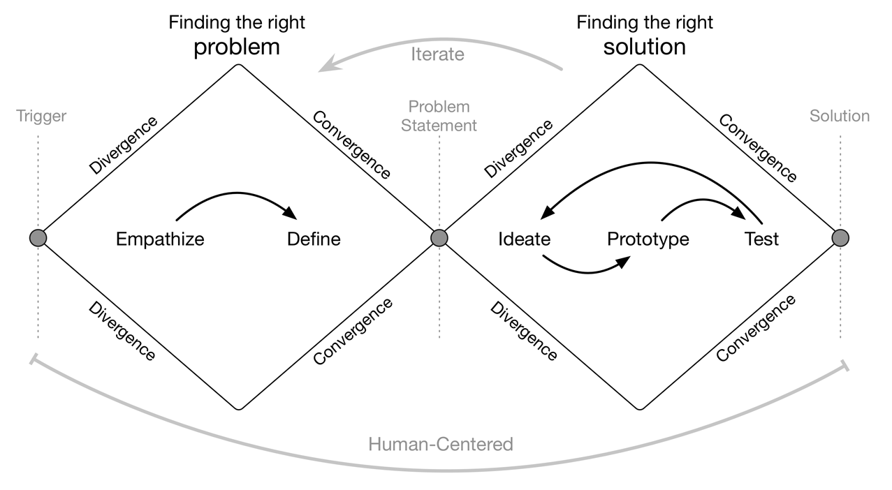
The design process at SEEK Asia is based on the Double Diamond Theory and Lean UX process. We aim to incorporate the key phases of Discovery, Definition, Ideation and Implementation in most of our projects.
Application review and shortlisting is an important step in the recruitment process. It's what the Hirers (Employers) do to find the right candidate to hire. The process is time-consuming and the hirers would use anything that helps them to speed it up.
The design process at SEEK Asia is based on the Double Diamond Theory and Lean UX process. We aim to incorporate the key phases of Discovery, Definition, Ideation and Implementation in most of our projects.

An extension of SEEK, SEEK Asia combines the two giants in job portal brands, jobsDB and JobStreet, under one roof and helps improve the lives of millions across Asia through comprehensive platforms.
The existing application processing flow was designed a few years back, as part of the release of the new platform. The flow was created without any usability testing and had little consideration for the technical and product limitations on the scope of work. It was simply a list of applications that user could review and move in-between pages (Unprocessed, Shortlist, Interview and Not Suitable).
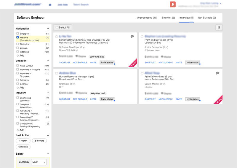
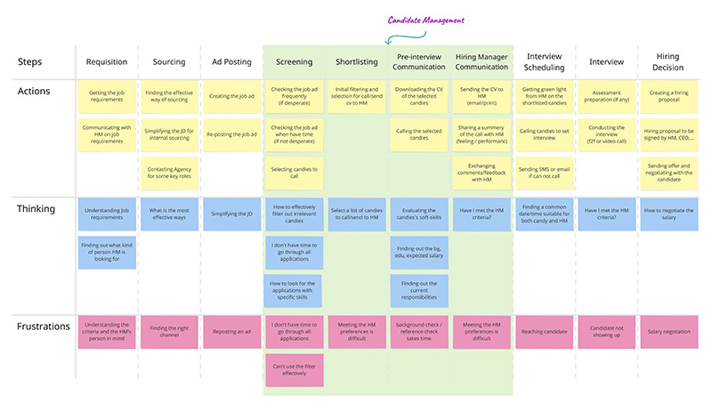
Through a formative (qualitative) research on the hiring journey, it was revealed that for most hirers (employers), finding specific applications with a specific skillset from the list of applications was very difficult.
They didn't have any filtering option or tools that would help them to quickly exclude those applications that did not have their desired skills/qualities.
The lack of a Search feature was painful especially when they were receiving more than 200 application for a single job ad.
They were using the browser search feature (CTRL+F) to look through the page, but it wasn't that productive either.
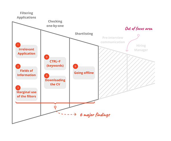
"How might we help hirers (employers) to quickly find an application with the right skillsets and qualities?"
Based on the above problems identified and given that the need/problem was straight forward, I worked towards addressing this pain by coming up with keyword search feature.

After sharing the sketches with the stakeholders and the design team and gathering their feedback, I created the second draft of the design.

After finalising the sketches, I mocked up the wireframes and worked with our visual design team to create the high fidelity mockups in Sketch.
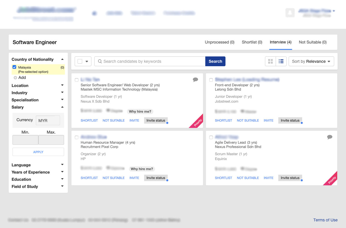
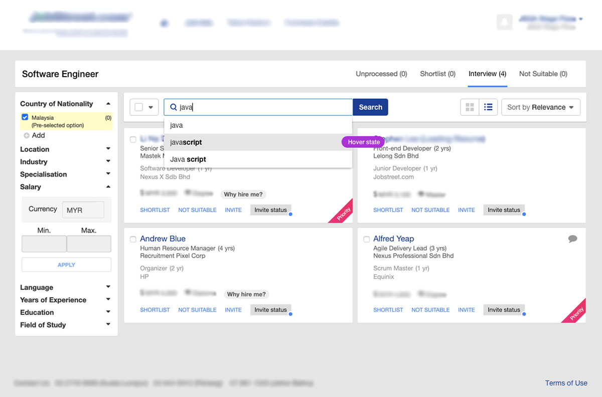
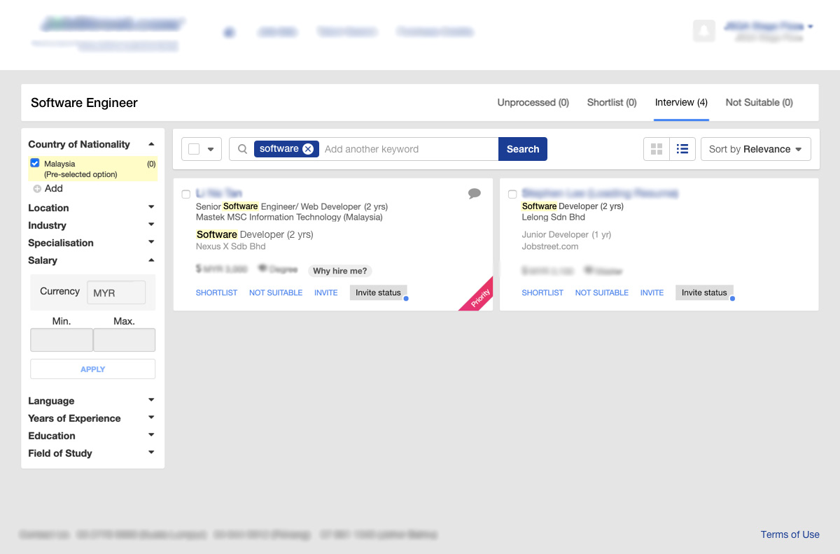
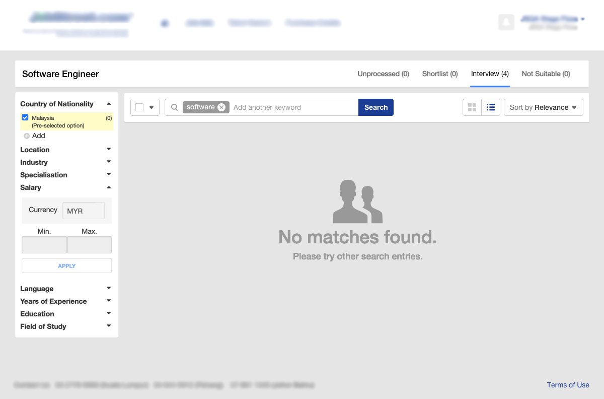
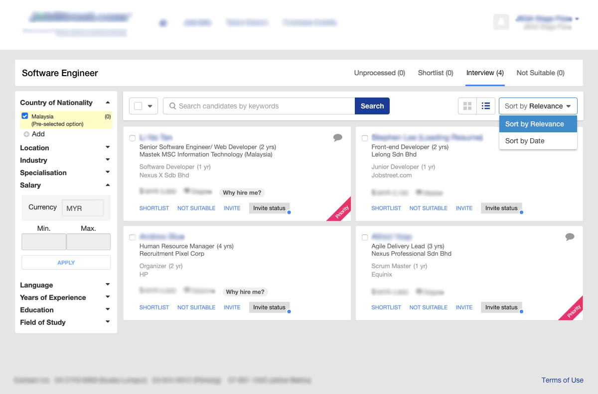
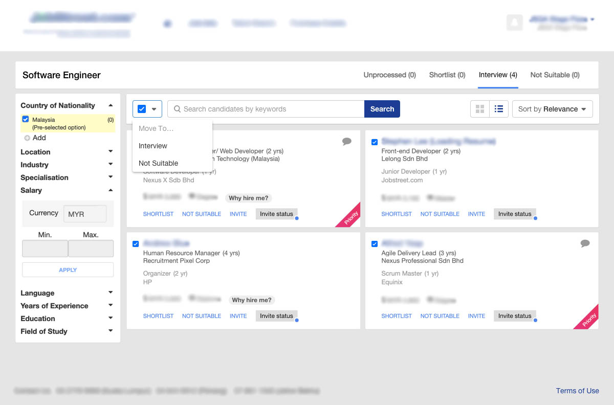
I conducted a usability testing session with 10 participants to validate whether the new designs would solve their problems.
The usability session revealed that there was no major issue with the design. The participants were excited to see this feature as they believe the search feature will help save their time.