Process
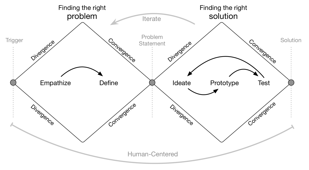
The design process at SEEK Asia is based on the Double Diamond Theory and Lean UX process. We aim to incorporate the key phases of Discovery, Definition, Ideation and Implementation in most of our projects.
Job Ad Creation form is one of the main features of the Recruitment platform. It's what the Hirers (Employers) use to create and post a job ad to find the right candidate to hire.
The design process at SEEK Asia is based on the Double Diamond Theory and Lean UX process. We aim to incorporate the key phases of Discovery, Definition, Ideation and Implementation in most of our projects.

An extension of SEEK, SEEK Asia combines the two giants in job portal brands, jobsDB and JobStreet, under one roof and helps improve the lives of millions across Asia through comprehensive platforms.
I am the sole designer of the Hirer (employer) space at the moment.
I joined SEEK Asia as a product designer in 2017. I support design across every aspect of our business on the Hirer (employer) space and am responsible for leading UX and UI across key parts of the Hirer (employer) side of the platform.
The current Job Ad Creation form was designed a few years back, as part of the release of the new platform. The flow was created without any usability testing and had little consideration for the technical and product limitations on the scope of work.
We noticed through our data analytics that there is a massive drop off in the current flow. Plus, the Customer Service and the Sales team have been receiving feedback from the users on some issues on the existing flow.
My approach to understanding the problem was to the following steps:
User research
There was some fundamental needs and opportunities of our primary users that was uncovered as part of strategic user research (that was lead by our UX research team and I was part of that project as well) where we conducted in-depth face-to-face interviews with more than 40 participants (including recruiters and hiring managers) in 4 different markets (Malaysia, Singapore, Hong Kong and the Philippines).
Heuristic evaluation & Expert review
Through expert review and heuristic evaluation, we uncovered the usability issues of the existing job ad creation flow.
Data analysis
Analysing the data helped on creating some hypothesis to be further explored.
Stakeholder, CC & Sales team Interview
Interviewing with the internal stakeholders and customer-facing teams helped to further elaborate on the user feedback and cross-check those feedbacks with the user research findings.
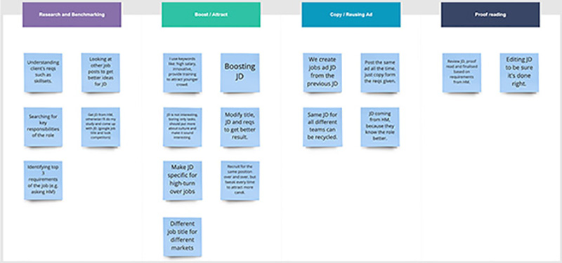
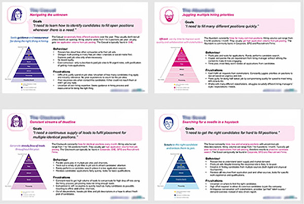
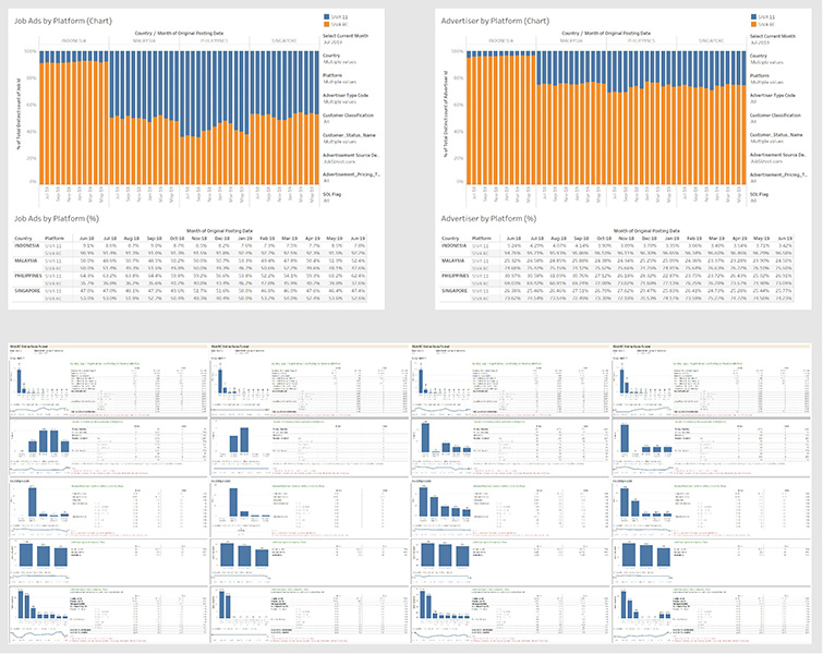
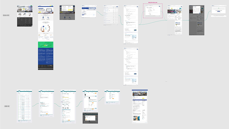
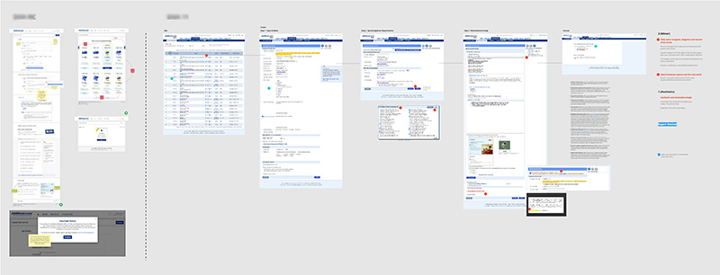
After analysing and synthesising the above information, I found the following key issues on the current platform:
Based on the above information, I created an objective that is addressing the users' need:
"Helping the hirers (employers) to create a un-assisted job ad, with an easy-to-use, intuitive and seamless experience that gives them confidence that they will receive the most relevant applications."
Based on the above problems identified and the objective, I worked towards addressing these pains by coming up with potential solutions that have the below characteristics:
I ran a mini-workshop with a couple of other designers to quickly sketch some solutions.
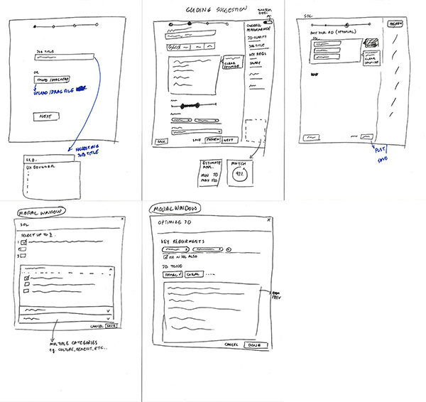
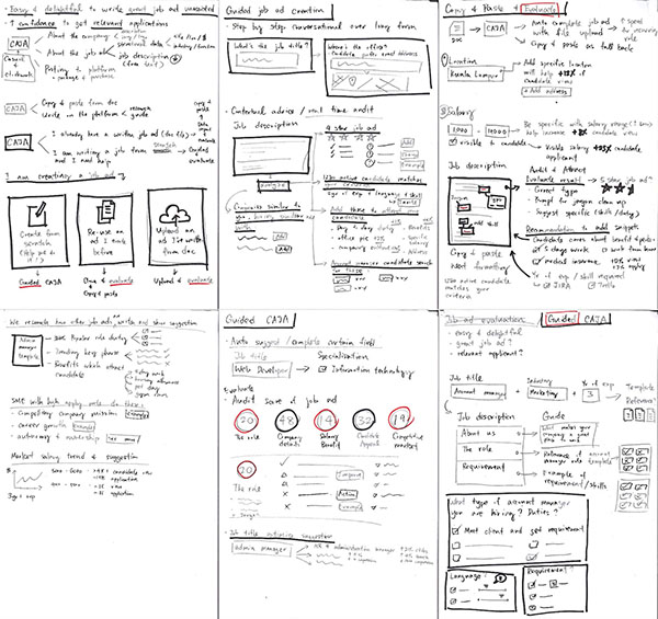
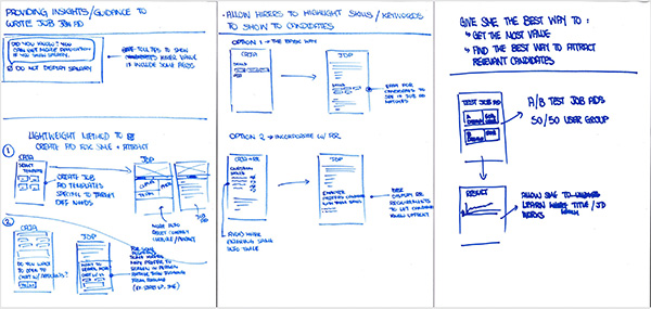
Then I spend another couple of days for the second round of ideation and sketching and created the first draft of an end-to-end flow.
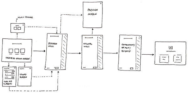
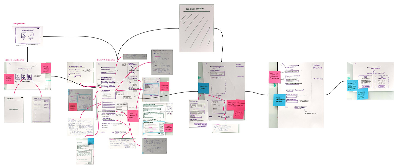
After sharing the sketches with the stakeholders and the design team and gathering their feedback on the overall layout and structure of the form, I mocked up the wireframes to apply their feedback and establish a standardised visual hierarchy and layout for the future components.

I repeated the sharing and the feedback gathering process for a second round and iterated the wireframe to be prepared for a user testing and concept validation.
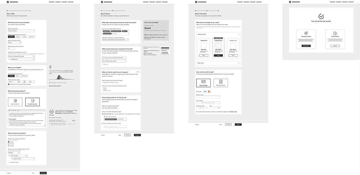
I conducted usability testing/concept validation with our primary users to validate whether the new designs would solve their problems. I observed how they interacted with the prototype and create the job ad. The usability session revealed that the new conversational UI is making a huge difference in helping non-expert users to get through this flow much easier.
Product, Design and Engineering team concluded that the first version (MVE) would be the core usability updates and UI refreshment due to its severity, UX and engineering effort required to rebuild it.
I created the high fidelity mockups in Sketch and then imported them into Invision to allow the engineers to inspect the file and export the HTML and CSS code. I worked very closely with the Front End team to spec out any missing interactions that were not covered in the high fidelity mockups.
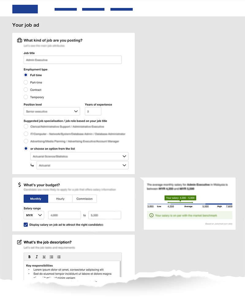
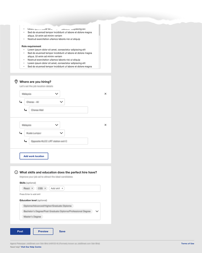
I've started the next round of iteration and testing while the engineers are building the MVE to be released. I'm working closely with the product manager and the tech lead to prioritising the next features to be developed to scale and deepen the experience.